Circular Action Alliance
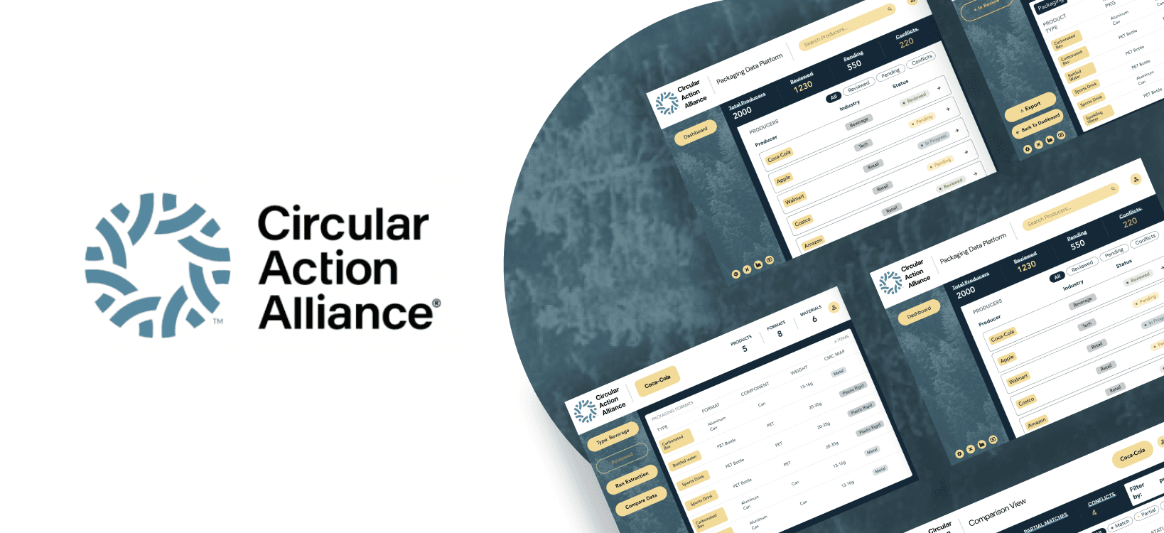
A desktop platform that helps analysts verify AI-extracted packaging data against producer submissions
Role
UX Designer
Timeline
Feb 2026 - April 2026 (3 Months)
Team
1 Project Manager
5 Software Developers
1 UX Designer
Type
Product Design • B2B
context
Turning messy data into confident decisions
Circular Action Alliance helps producers comply with Extended Producer Responsibility (EPR) regulations by collecting packaging data across thousands of companies.
While AI can extract packaging information from public sources, analysts still need an efficient way to verify that data before it can be trusted.
How might we help analysts review large, complex datasets without overwhelming them?
Goals
Reduce review time for producer submissions
Simplify AI vs. reported data comparisons
Increase confidence through source-backed insights
Create a workflow that scales to thousands of producers
research
Early Thinking
Formal user interviews weren't available on this timeline, so I worked directly with our PM, who had regular contact with analysts, to map the review workflow. I validated this workflow in a short walkthrough with 5 analysts supplemented with research on enterprise dashboards, decision support systems, and AI-assisted review tools which surfaced 3 insights I hadn't anticipated.
Navigation isn't analysis
Dashboards with 9+ modules measurably increase cognitive load and reduce accuracy. The dashboard should help analysts find the right producer and not analyze data.
Context improves
decision confidence
Contextual decision support has been shown to raise expert agreement from 65% to 97%. Analysts need producer context before evaluating AI-flagged discrepancies.
Complexity should be
revealed gradually
Across 71 decision-support system studies, workflow-integrated guidance succeeded 75% of the time vs. systems requiring users to seek information separately. Key details should surface immediately with technical depth that stays available on demand.
wireframing
Designing around decisions, not screens

Rather than designing pages independently, I mapped the analyst's decision-making process first. Each screen exists to answer one question before moving to the next.
Low-fidelity wireframes explored information hierarchy before visual design.
Dashboard: Search and filter producers while tracking review status.
Producer Profile: Provide a centralized view of products and supporting data.
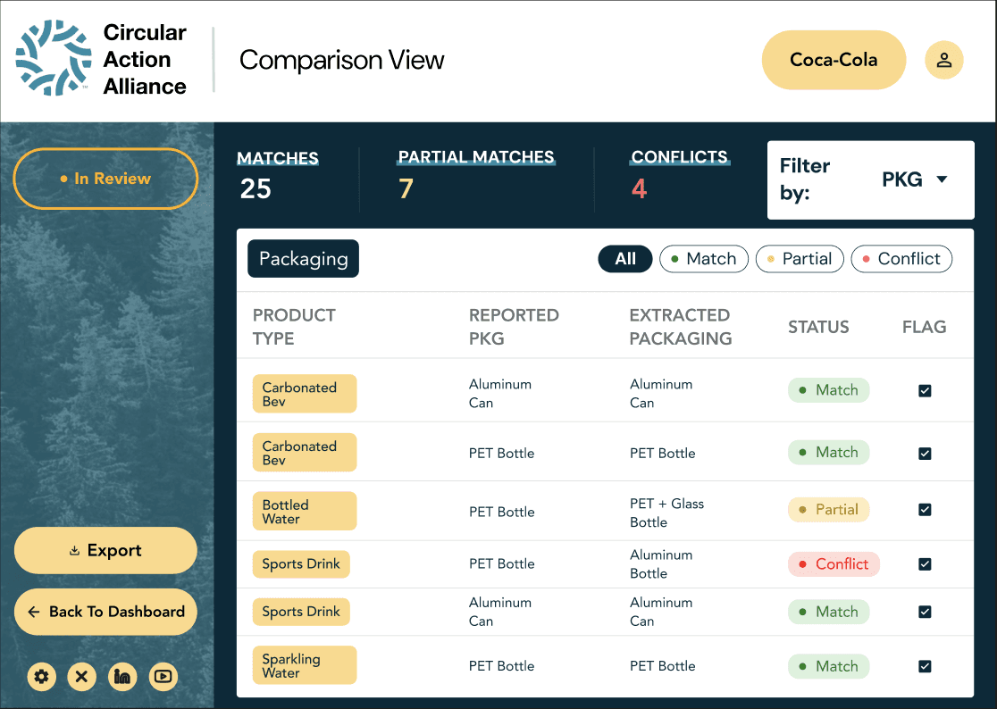
Comparison View: Present AI-extracted and producer-reported data side by side to simplify validation.


design system
Building the Interface
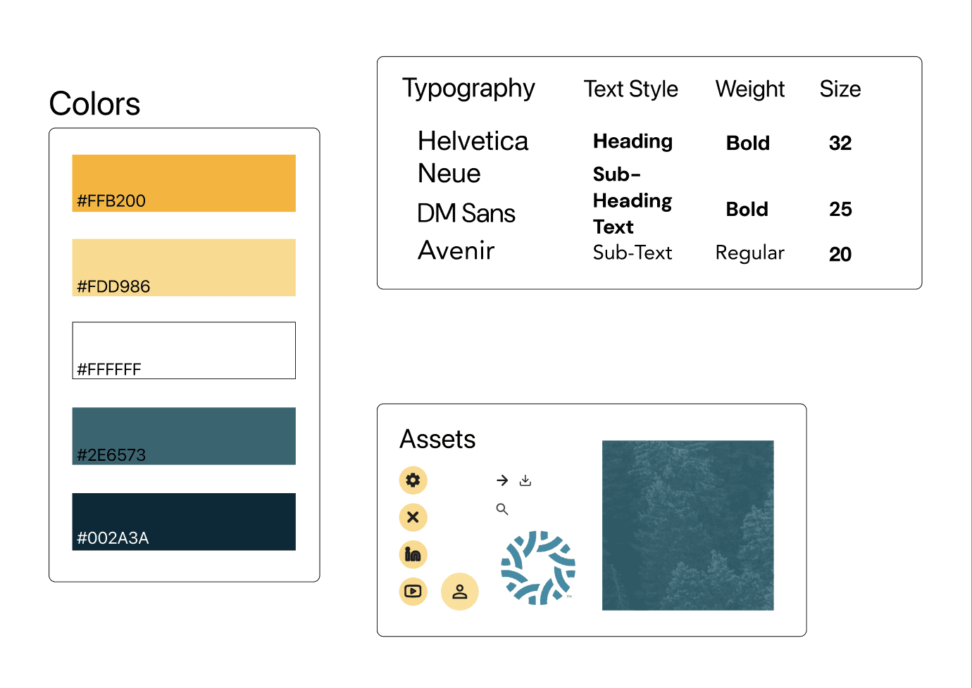
Rather than introducing a new visual language, I extended Circular Action Alliance's existing design system.
Using their typography, colors, and component styles reduced the learning curve while making the platform feel like a natural extension of their ecosystem.
Design Stack
dashboard
Find the right producer, fast.
Early versions resembled spreadsheets filled with metadata. I simplified the dashboard into a navigation tool by prioritizing: Search, Filters, Review Status, Producer Names, and Industry.
Less scanning. Faster discovery.

producer profile
Keep everything in context.
Instead of splitting packaging data across multiple pages, I consolidated related information into a single, vertically structured view. Users review: Products, Packaging Types, Materials, Weight Ranges without constantly switching pages.
The Producer Profile Page, however, cost something as jumping straight from the dashboard to comparison would've saved a click. But a number without context isn't trustworthy, it's just a number. Producer Profile exists specifically to give analysts that context first.

comparison view
Let the interface do the comparing.
Instead of forcing analysts to compare two datasets mentally, every reported value sits directly beside its AI-extracted counterpart.
Color-coded validation highlights discrepancies instantly.
iteration
Less information. Better decisions.

Dashboard Iteration 1
Iteration 1 tried to show everything: technically complete, cognitively exhausting.

Dashboard Iteration 2
Iteration 2 added breathing room, but every producer still carried the same visual weight, so a reviewed entry and a pending one looked equally urgent.
Walking my PM through it, the feedback was consistent:
"I can't tell what actually needs my attention here, every field has the same visual weight, so I end up reading the whole row just to find the one thing that's wrong."
The fix: make status the first thing you see, not the last thing you notice.
Progressive disclosure
Clear section hierarchy
Expandable technical details
Status-based Color Coding

Dashboard Iteration 3
Status color-coding finally solved what whitespace alone couldn't: a Pending producer now reads differently from a Reviewed one at a glance, without requiring analysts to read every word.
Rather than reading everything, analysts can quickly identify what matters and expand only when needed.
Key Design Decisions


key design decisions
final design
From extraction to validation
reflection
My takeaways
If given more time…
Enterprise ≠ Consumer
Consumer products reduce complexity while enterprise software organizes it so users can make confident decisions, not simpler ones.
Design the resolution workflow
Flow ends at "Flag", the next step is designing what happens after: how a conflict gets resolved, and by whom.
User Research is possible without direct interviews
Without formal analyst interviews, working directly with my PM to map the real workflow was the difference between guessing and designing with intent.
Interview outside the analyst pool
Analysts know the workflow but people outside it are more likely to hit the edge cases a routine can blind you to.
Trust is a design decision, not a given
Every extra click has to earn its place.
Test across industries
Producers span beverage, retail, tech, and more. Worth testing whether the same hierarchy holds up across very different data profiles.