Redesigning Visual
Storytelling with Music
An editorial design project that transformed themes from Kendrick Lamar's music into a cohesive visual narrative using typography, illustration, and sequential storytelling.
Role
Visual Designer
Timeline
Sep 2024 - May 2025 (8 Months)
Type
Visual Design • Editorial

12
Original
Artworks
870k+
Online
Views
100+
Visitors at art
exhibition
5
AP Art
Score
overview
Visualizing Stories Beyond the Lyrics
Music often communicates ideas that are difficult to explain through words alone. To Pimp a Butterfly by Kendrick Lamar explores identity, race, power, and self-worth through layered symbolism that can be difficult for new listeners to interpret.
I challenged myself to translate each song into a single illustration, using visual storytelling to make abstract themes more approachable while preserving their emotional depth.
Goals
Translate one song into one original illustration
Communicate complex themes through visual storytelling
Create a cohesive visual language across an entire collection
challenge
How do you visualize ideas that were never meant to be seen?
The album relies on metaphor, symbolism, and nonlinear storytelling. Rather than illustrating lyrics literally, I needed to design images that helped viewers understand each song's emotional message without removing its ambiguity.
user personas
Understanding the Viewer
I decided to design for viewers who appreciate music but may not understand the deeper themes behind the album.
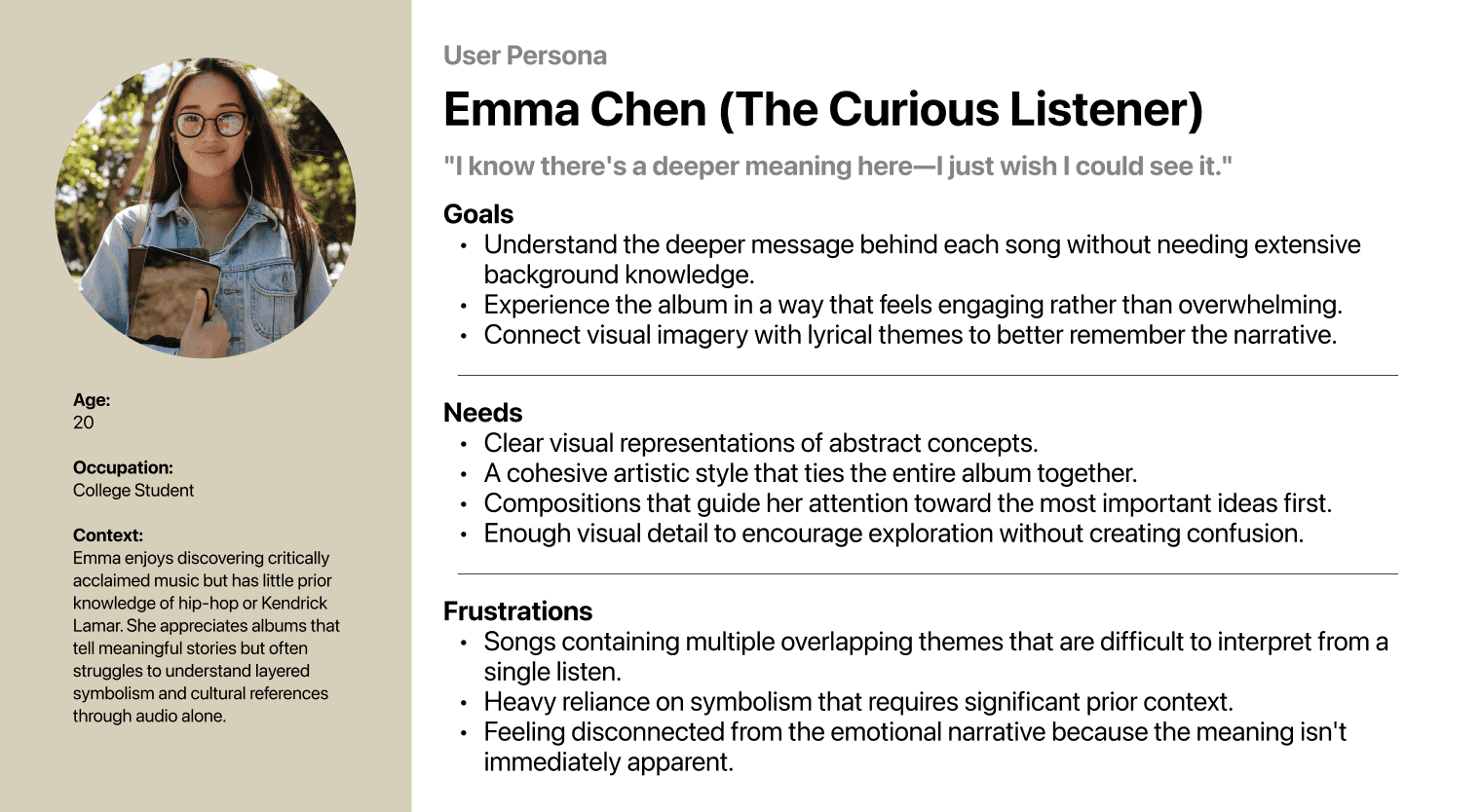
Rather than asking viewers to decode symbolism on their own, every composition needed to communicate meaning through composition, hierarchy, color, and emotion while still leaving room for interpretation.
research
Before drawing, I needed to understand the story.
Every illustration began with research rather than sketching. Analyzing lyrics, interviews, album breakdowns & podcasts, historical context, editorial illustration and poster design led me to the question that guided every piece: "What should someone understand after seeing this?"
key findings
Patterns that emerged.



early exploration
Ideas before illustrations
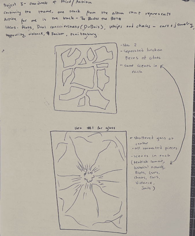
Rather than committing to the first concept, I explored multiple compositions before choosing a direction. Each sketch tested composition, visual hierarchy, symbolism, medium, and focal point



design decision 1
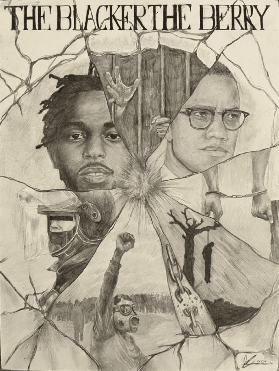
Showing multiple perspectives in The Blacker the Berry
One portrait couldn't capture this song's complexity. I explored literal scenes, but they oversimplified the message.
Instead, I created a fractured composition inspired by shattered glass, allowing multiple narratives to exist within one illustration while maintaining a clear visual hierarchy.
Trade-off
Clarity vs. Complexity
To balance both:
One dominant focal point
Smaller supporting narratives
Contrast guiding the viewer's eye
design decision 2
Visualizing emotion without showing it
Unlike other songs, "i" is almost entirely internal. Literal imagery explained the emotion too directly. Instead, I relied on atmosphere.
The expanding ink forms, body language, and symbolic objects communicate internal conflict while encouraging viewers to spend time interpreting the piece.
Trade-off
Immediate understanding vs. Interpretation
The illustration communicates emotion instantly while rewarding closer observation.

final collection
One album. Twelve visual narratives.


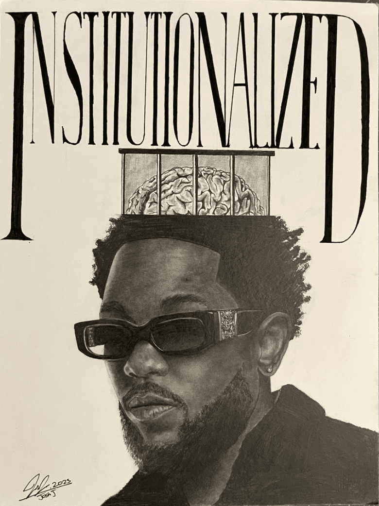
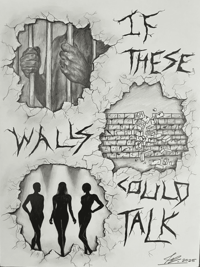


reflection
UX exists beyond digital products.
Although this wasn't a traditional web or mobile project, the same UX principles shaped every decision. I wasn't designing interfaces, I was designing understanding.
Each illustration considered how viewers would interpret information, where their attention would go first, and how visual hierarchy could reduce cognitive effort without removing complexity. This project reinforced that great design isn't defined by the medium. Whether designing software, a poster, or an illustration, the goal is the same: help people understand something they couldn't before.
listen here!