VOID Tech (Atmos)
A weather app designed for both frequent travelers and long-term planners through personalized experiences.
Role
UI/UX Designer
Timeline
Nov 2025 (2 weeks)
Type
Product Design • B2C
Tools
Figma

context
One app, two very different users
Most weather apps are built around daily forecasts, but not everyone checks the weather for the same reason.
Frequent travelers need quick access to current conditions across multiple cities, while long-term planners care more about seasonal trends and future patterns.
The challenge became designing a single experience that supported both workflows without overwhelming either user.
How might one weather app serve two completely different ways of planning?
Goals
Make current weather easy to scan across multiple cities
Support both short-term travel and long-term planning
Create a calm, intuitive interface for everyday use
research
Different goals require different experiences
Rather than designing for a generic weather app user, I centered the product around two distinct personas.


wireframing
Mapping information before designing interfaces
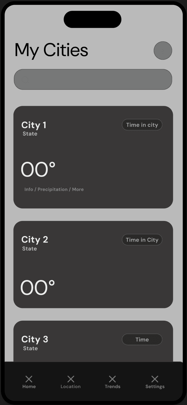
Before moving into high fidelity, I explored how users would navigate the app and what information deserved priority.



design system
Designing for quick glances
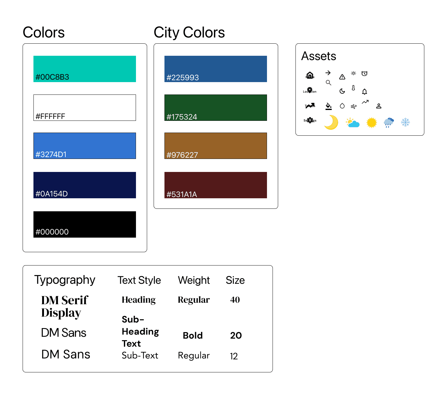
Weather apps are opened dozens of times throughout the day, often for only a few seconds.
I designed a visual system focused on clarity rather than decoration by using: Large temperature typography, High contrast, Rounded cards for grouping information, Consistent spacing, Minimal color outside weather conditions
Design Stack
home page
Prioritizing what matters now.
The Home screen answers one simple question: "What do I need to know right now?"
Instead of overwhelming users with forecasts immediately, I prioritized: Current temperature, Today's highs & lows, Weather conditions, Wind, humidity, and UV Hourly forecast Five-day outlook.

locations page
Helping travelers compare cities faster.
Frequent travelers often check several cities throughout the day.
Instead of requiring repeated searches, I created a dedicated locations page where each city becomes a quick, glanceable weather card showing: Temperature, Current conditions, Local time.

trends page
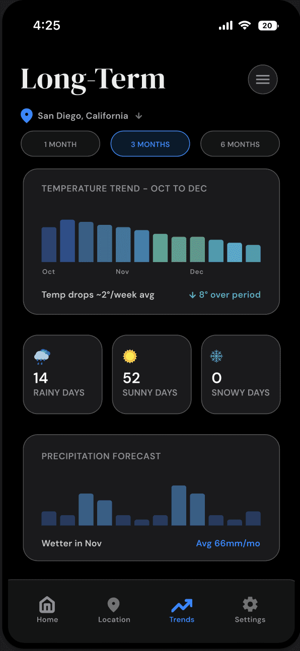
Designing beyond the seven-day forecast.
Most weather apps stop at weekly predictions.
To support long-term planning, I introduced a trends page that visualizes weather over one, three, and six months. Instead of daily forecasts, users see: Temperature trends, Rainfall patterns, Seasonal summaries, Monthly insights
settings page
Adapting to different preferences.
Rather than scattering controls throughout the app, I centralized customization into a dedicated Settings page. Users can personalize: Temperature units, Wind speed units, Notifications, Appearance, Accent colors.

final design
One product, multiple workflows.
reflection
Good information hierarchy creates better experiences.
This project reinforced that UX isn't about displaying more information, it's about presenting the right information at the right moment.
Designing for two distinct personas pushed me to think beyond individual screens and instead focus on how information architecture could support multiple workflows within a single product.
If I continued this project, I'd expand personalization by allowing users to customize their dashboard layout, reorder modules, and receive context-aware recommendations based on travel plans and seasonal patterns.